The collections
The Museum Plantin-Moretus conserves a multiple collections. Old printed books and manuscripts, printing presses and tools, paintings, prints and drawings, furniture and paintings and several archives.
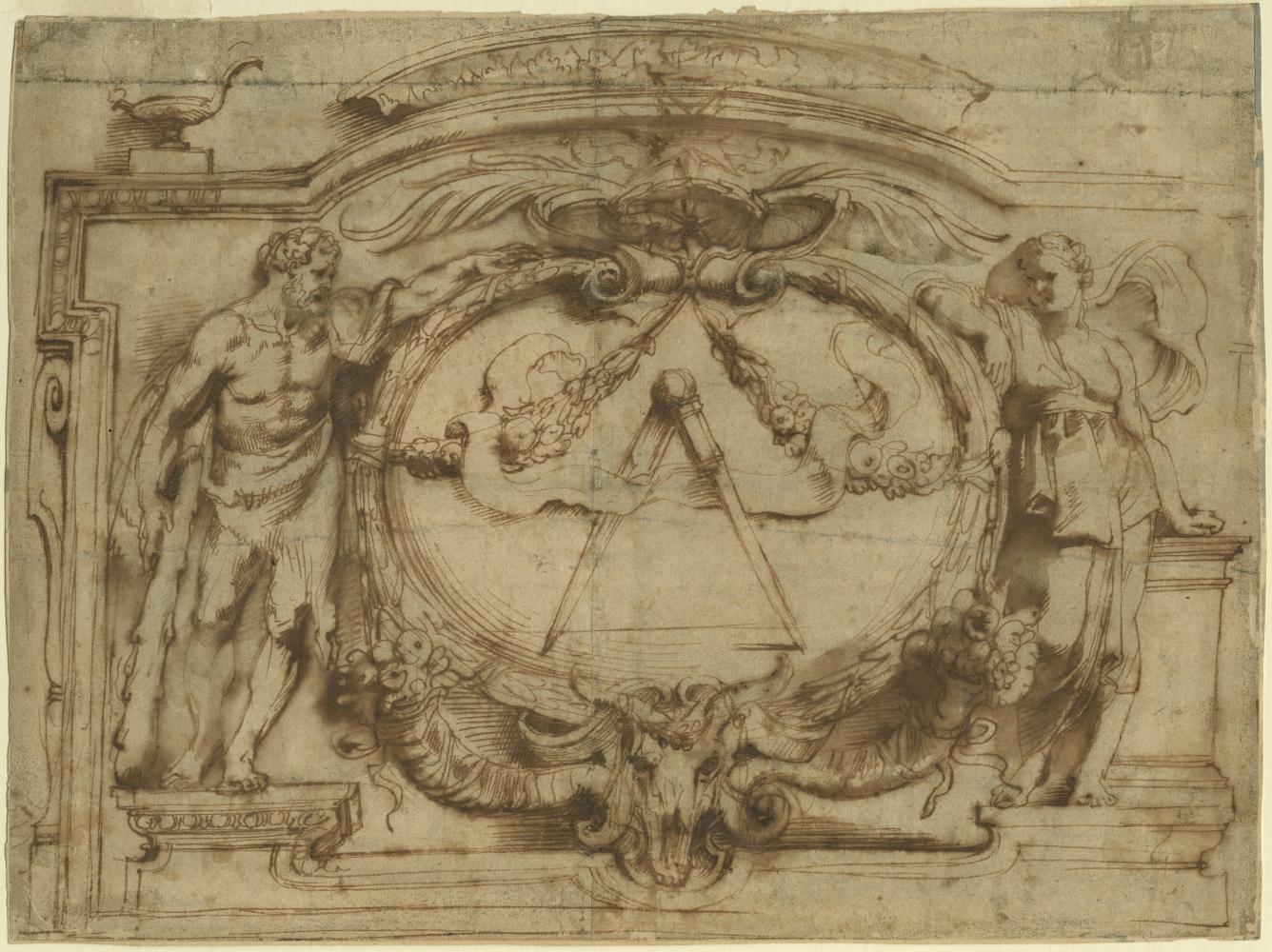
As well as painting for Balthasar I Moretus, Rubens also designed printer’s marks. This design was used for the title page of the second volume of the Opera omnia, (collected works) of the humanist Justus Lipsius.
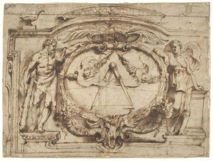
What do we see? A design by Rubens for the printer’s device of the house. The central symbol is the compass. Why a compass? It has one fixed leg and one “working” leg. On the left, the Greek hero Hercules represents labor (work), while on the right we see Constantia, steadfastness. Together, they perfectly embody the house motto Labore et Constantia (“through work and steadfastness”). This kind of learned visual language is typical of the baroque books created by Balthasar Moretus and Rubens. Once the drawing was approved, it was engraved and turned into a print-ready copper engraving.
From 1608 onwards, Rubens worked closely with the Officina Plantiniana, the printing house of Plantin and the Moretus family. At the time, it was run by Balthasar I Moretus, a childhood friend of the baroque painter. Rubens designed no fewer than twenty-four title pages and also produced illustrations for various books. This drawing formed part of the title page for the collected works of the great humanist and family friend Justus Lipsius.
Rubens was paid for his work and also received presentation copies in return. These books helped him build up his remarkable personal library.