Pieter Bruegel is probably the most important and most innovative artist from the 16th century. Besides being the painter of the world-famous 'Spreekwoorden' (Proverbs) and 'Dulle Griet' (Mad Meg), he was also a print designer. These works of art on paper certainly match his paintings when it comes to inventiveness, complexity and visual appeal.
To date, we have only found 40 paintings by this artist from Antwerp, yet as many as 71 print compositions are known to be his work. The Museum Plantin-Moretus holds a print of almost all of these compositions in its storage depots.
What is a Bruegel print?
Around the middle of the 16th century, Hieronymus Cock founded the print publisher ‘Aux Quatre Vents’ (The Four Winds) in Antwerp, which became one of the most important in the Low Countries.
For its prints, the publisher first asked artists, including Bruegel, to provide design drawings, before getting specialised etchers and engravers to carve these designs into the copper plate. The copper plate was then used to print several paper copies.
In other words, a Bruegel print is a print for which Pieter Bruegel sketched the design. 60 of his drawings are still in existence today. The design was engraved in the copper plate by the printmakers Frans Huys, Pieter van der Heyden, Philips Galle and Lucas and Joannes van Doetecum, each in their own personal style.
The inscriptions on the prints reveal who was involved in producing the print: ‘P. Bruegel inve(ntor)’ (P. Bruegel designer) and ‘H. Cock excud.’ (published by H. Cock). When it came to the engravers, most were simply referred to with a monogram: ‘PAME’ (Pieter Van der Heyden) or ‘FH’ (Frans Huys).
The prints – which were much cheaper than paintings – were intended for the intellectual, humanist-focused urban elite, including merchants, the clergy and specialised artisans.
Bruegel's print designs were a great influence on a range of new genres, which emerged around the middle of the 16th century in visual art, such as landscapes, seascapes, and moralising and allegorical scenes.
Pieter Bruegel, designer; Frans Huys and Cornelis Cort, engravers; Hieronymus Cock, publisher. Een hulk en een boeier voor een kust (A Dutch Hulk and a Boeier). 1565. Engraving. PK.OP.14051; III/H.287
From a series of ten sailing ships. This print was begun by Frans Huys around 1561, however, Huys died in 1562. Several years later, the publisher Cock arranged for Cornelis Cort to complete this copper plate.
Bruegel made many sketches of ships, both on his travels and in his home town of Antwerp. These now provide rich information for ship historians, thanks to their accuracy and detail.
The ship-portrait genre flourished particularly from the late-16th century in the Northern Netherlands, as the most important maritime nation of its day. Bruegel's series of ships played an important role in the further development of this very specific genre in printed art.
The second Bosch
Early in his career, the young Bruegel created various designs, including Grote vissen eten kleine vissen (Big fish eat little fish) and De Verzoeking van de heilige Antonius (The Temptation of Saint Anthony), which follow on nicely from the ‘drolleries’ created by the artist Hieronymus Bosch, who died earlier in 1516. Bosch monsters and strange monstrosities were still really popular around the mid-16th century. Hieronymus Cock and Pieter Bruegel took advantage of this with their Bosch-like prints. This soon earned Bruegel the nickname ‘the second Bosch’.
What is striking is that these prints are not marked with Bruegel's signature – in fact, Grote vissen eten kleine vissen (Big fish eat little fish) even names ‘Hieronijmus Bos’ as the designer, while there is no doubting the fact it is the work of Bruegel.
Pieter Bruegel, designer; Pieter Van der Heyden, engraver; Hieronymus Cock, publisher. De grote vissen eten de kleine op (Big fish eat little fish). 1557. Engraving. PK.OP.13802; III/H.62
This print claims Hieronymus Bosch as its 'inventor', which is untrue, since the design drawing for this print has survived. Pieter Bruegel drew and signed it in 1556.
The print portrays the universal truth that little fish are food for big ones. In the foreground, in a boat, a father points this out to this son, also note the caption on the print.
Pieter Bruegel, designer; Pieter Van der Heyden, engraver; Hieronymus Cock, publisher. De verzoeking van de Heilige Antonius (The Temptation of Saint Anthony). 1556. Engraving, only state. PK.OP.13784; III/H.41
Saint Anthony was a hermit, who dedicated his life to prayer and reflection. This undertaking was extensively and severely challenged by both tempting and terrifying visions. In the 16th century, the holy symbol stood for the fortitude displayed by true believers when resisting and facing life's trials and temptations. For Bruegel, this subject was the perfect opportunity to illustrate the most fantastical monsters, monstrosities and temptations. The public loved such ‘drollery'.
This print is the earliest-known example in which Pieter Bruegel is clearly inspired by the work of Hieronymus Bosch.
The fact that such prints were considered amusing is confirmed by the way they are described. In 1558, Martin Le Jeune, a Paris bookseller, received twelve copies of ‘Sainct Antoine drolerie’ from Christopher Plantin.
Large landscapes
The so-called Large Landscapes are also among Bruegel's pioneering early work. Like every good renaissance artist of his day, Bruegel made a voyage to Italy, to study the remains of ancient times and contemporary Italian painting.
His journey through the Alps made a deep impression on him, which he integrated in his designs for Large Landscapes when returning to Antwerp in 1555. A late 16th-century art historian made reference to this, writing that Bruegel was so good at drawing the nature that it seemed like the artist had swallowed up the Alps during his travels, only to spit them out again on canvas and panels when he got home. Even so, they are not ‘real-life’ views of nature, but 'ideal' landscapes composed in the studio. These realistic mountain views had a great influence on the development of landscape art in the Netherlands.
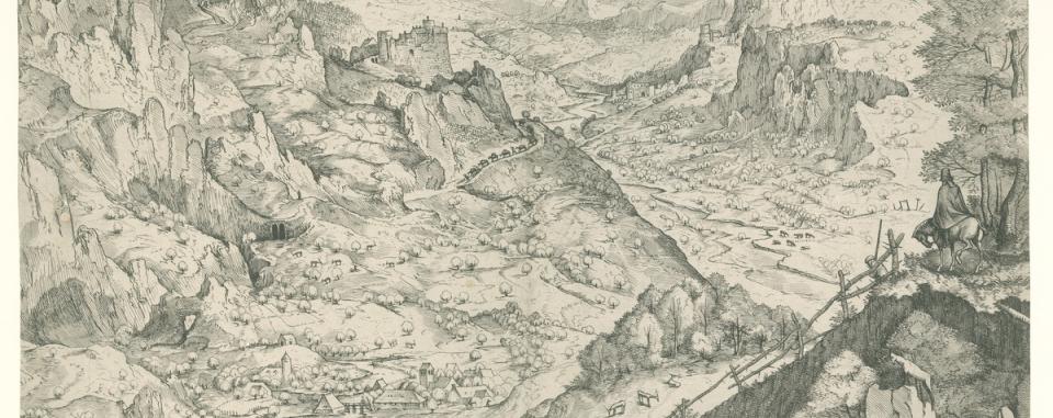
Pieter Bruegel, designer; Joannes and Lucas Doetecum, engravers; Hieronymus Cock, publisher. Large Alp landscape ca.1555. Etching and engraving, only state. PK.OP.18330; IV/C.65
In the right foreground, a rider on his horse observes a great and staggering landscape. Bruegel was fascinated by the Alps, the mountains that he discovered when travelling to France and Italy in 1552-1554.
His wide panoramic landscapes were very successful. These are not ‘real life’, thus not founded on a specific geographical context, but were actually developed in his workshop.
Pieter Bruegel, designer; Frans Huys, engraver; Hieronymus Cock and Cornelis van Dalem, publishers. Zeeslag in de straat van Messina (Naval battle in the Strait of Messina). Post 1561. Engraving and etching, printed from two copper plates. PK.OP.19879; V/H.31
A monumental and topographically accurate and correct engraving from 1561, bearing witness to Bruegel's voyage to Italy, during which he certainly travelled to the south. Bruegel made many drawings and sketches during his trip.
The print illustrates a sea battle with Turkish galleons in the strait of Messina. The galleons are very accurately portrayed, which suggests that he had actually seen and drawn them. On the left, you can see the burning port town of Reggio on the mainland and the bay of Messina on the most Easterly point of Sicily.
The print was printed from two copper plates.
Pieter Bruegel, designer; Frans Huys, engraver; Hieronymus Cock, publisher. Ijsvermaak aan de Sint – Jorispoort (Ice Skating before the Gate of St. George). Ca. 1558. Engraving, first of two copies. PK.OP.14031; III/H.282
Scene of a clear winter's day showing the citizens of Antwerp enjoying skating, prick sledging or taking cautious steps on the frozen canals around the city walls. In the background stands the largest and most important city gate which, for centuries, was part of what was known as the Spanish walls (these were demolished in the second half of the 19th century).
In the second half of the 16th century, there was a significant rise in the number of winter scenes. This was due to climatological reasons, namely very low temperatures and winter precipitation during the so-called ‘Little Ice Age’.
Moralising and allegorical prints
Bruegel's allegorical and moralising prints are among his most spectacular compositions. He mastered the art of displaying complex, learned iconography in legible compositions, revealing a brand new visual inventiveness. Prints of a moralising or allegorical nature were very popular in the second half of the 16th century among the intellectual, humanist-focused urban elite, for whom these prints were intended. Bruegel stood out from other artists in the way he filled the ‘serious’, moralising topics highlighting human weakness, with mockery, humour and irony.
Pieter Bruegel, designer; Pieter Van der Heyden, engraver; Aux Quatre Vents, publisher. Sottebollen (Numbskulls), or het Zottenfeest (The Festival of Fools). Post 1570. Engraving. PK.OP.21318; IV/H.162
This print was published following the death of Pieter Bruegel. We see a kind of procession, a march moving from left to right in the composition, before dancing off into the background, where musicians provide music.
In the foreground, ‘fools’ play a game of skittles, with balls that need to hit the skittles.
With this theme, Bruegel mocks the stupidity and gullibility of people who will believe anything. The print also ties in with his prints illustrating proverbs: ‘iemand bij de neus nemen’ (literally taking someone by the nose, meaning to pull someone's leg), or ‘iemand een bril verkopen’ (literally to sell someone spectacles, meaning to cheat on someone). The caption reads things such as: ‘er zijn zotten in elk natie, ook al dragen ze niet allemaal een narrenkap’ (there are fools in every nation, although they don't all wear a fool's hat); and also: ‘Die zotten nemen elkaar bij de neus / die verkopen elkaar brillen’ (Those fools pull each other's legs/they cheat on each other).
Pieter Bruegel, designer; Pieter Van der Heyden, engraver. The Land of Cockaigne. Post 1570?. Engraving. PK.OP.13800; III/H.56
In 1567, Bruegel painted his version of this utopian paradise on earth, where all is plentiful and where people are able to eat and drink to their heart's content, without working and without effort. This engraving is copied from the painting. No publisher is mentioned, and it is presumed that this print was made and published after the death of Hieronymus Cock by Pieter Van der Heyden. Or perhaps it was the owner of the painting who ordered a print reproduction to be made.
People could only reach the Land of Cockaigne (the land of milk and honey) by eating their way through a mountain of rice pudding, seen to the left of the composition. In the centre, three people who have eaten their fill lie sleeping: a farmer, a scholar and a soldier, representing three social classes, and recognised by their attributes. In this work, Bruegel plays with the balance between humour in the theme and imagery, and the moralising undertone, namely that surrendering to laziness and greed leads to little benefit.
Pieter Bruegel, designer; Pieter Van der Heyden, engraver; Hieronymus Cock, publisher. Keisnijding (The Stone Operation) or De heks van Mallegem (The Witch of Mallegem). 1559. Engraving, third of five copies. PK.OP.18703; IV/H.49
This print has two names. It was originally called Keisnijding (The Stone Operation), and later De heks van Mallegem (The Witch of Mallegem).
In this print, Bruegel mocks the ability to cheat and be cheated. In the fictive city of Mallegem (city of ‘mallen’ as the silly or the crazy), a large group of fools is gathered around a table on which a quack (for a fee) relieves patients of a stone in the head, as the potential cause of their madness.
The focus lies on the quack – Master Snottolf (Master Snotnose - in Old Dutch also the nickname for scum or a dirty slippery character) who proudly shows off the stone he has just ‘removed’. But look at his colleague sitting under the table with a basket full of stones, which he passes to the quack for the treatment.
Pieter Bruegel, designer; Philips Galle, engraver; Hieronymus Cock, publisher. Alchemist. 1556-1560. Engraving. PK.OP.18564; IV/G.85
On the left, an alchemist melts his last coin in a desperate attempt to find the philosopher's stone, which should enable him to make gold and precious metal. His wife reveals her empty purse, his children search for food without success. His assistant, wearing a fool's hat, inflames his crazy passion with bellows. In the background, we see how the family end up being taken into a home for the poor.
The scholar on the right of the composition seems to be the commentator of the scene and points to the word ALGHEMIST: which plays not only on the word alchemist but also ‘al-gemist’ and ‘alles-mist’ meaning already lost and missing everything.
In literature, this print is generally considered a satirical representation, with a negative image of alchemy, as the forerunner of chemistry.
Pieter Bruegel, designer; Philips Galle, engraver; Hieronymus Cock, publisher. De rechtvaardigheid. (Justice) Ca. 1560. Engraving. PK.OP.13263; III/G.643
From the set of Seven Virtues, 7 engravings following on from Bruegel's series of Seven Sins. All preliminary sketches have been preserved.
The Virtues are shown as female figures with attributes placed among all kinds of realistic scenes, carefully designed compositions in surroundings that every one of Bruegel's contemporaries would have recognised as his own, with buildings, clothing, objects, attributes that they could immediately identify from their day. In this way, justice is surrounded by scenes of jurisdiction, martyrdom and executions.
Johannes Wierix, engraver. The man with the purse and his flatterers. Ca. 1568. From a series of twelve proverbs. Engraving. PK.OP.10619; II/W.224
Johannes Wierix, engraver. De boogschutter is kwistig met zijn pijlen (The archer wastes his arrows). Ca. 1568. From a series of twelve proverbs. Engraving. PK.OP.10620; II/W.225
Pieter Bruegel, designer; Pieter van der Heyden, engraver; Cornelis van Tienen, publisher. The Marriage of Mopsus and Nisa. 1570. Engraving. PK.OP.13801; III/H.37
We see a joke wedding, performed by a group of street actors. A woman dressed in rags is pulled from the wedding tent by her brand-new ‘bridegroom’ to dance in celebration of this joyful event. Note the unusual musical accompaniment.
In fact, this print uniquely blends the illustration of a folk, carnivalesque tradition and a literary reference to ancient times. The ironic Latin caption ‘Mopsus marries Nisa, what may not we lovers hope for’, (the undertone of which implies that if this impossible wedding can be performed then literally anything is possible in love) refers to Virgil. This reference may have been added posthumously by the publisher Hieronymus Cock as a playful joke, which his rather educated audience would certainly have appreciated.
Posthumous prints
In 1562, Bruegel moved to Brussels, after which his focus on prints declined. The artist's death in 1569 meant that his series of four seasons, of which the Summer is shown here, was left completed. A number of different prints of existing paintings and drawings by the popular artist were still published after his death, such as De Dood van de Maria (The Death of the Virgin), engraved by Philips Galle based on a grisaille (painting in shades of grey) by the artist, owned at the time by the famous cartographer Abraham Ortelius.
Pieter Bruegel, designer; Pieter Van der Heyden, engraver; Hieronymus Cock, publisher. Summer/AESTAS. 1568-1570. From the series: The four seasons, with allegories from the seasons. Engraving. PK.OP.13779; III/H.34.b
The summer is one of the last draft drawings made by Bruegel for the publishers Aux Quatre Vents, in 1568.
In Summer, Bruegel portrays the fruit harvest (June), the hay harvest (July), and the grain harvest (August).
The high horizon used in the print allows plenty of room for its many scenes.
Pieter Bruegel, designer; Philips Galle, engraver, published by Philips Galle and Abraham Ortelius. Het sterfbed van Maria. (Mary on her deathbed). 1574 (date on first state). Engraving, second state of two. PK.OP.18562
Engraving of the grisaille (painting in shades of grey) by Pieter Bruegel from 1564 showing Mary's deathbed, owned by the famous geographer and humanist Abraham Ortelius, as a good friend of Bruegel. After Bruegel's death, Ortelius instructed his friend Philips Galle to make an engraving of the painting. According to the caption, the print was specifically intended to share with his friends.
Philips Galle, the most important engraver and print publisher in Antwerp after the death of Hieronymus Cock, cleverly suggests the grisaille with the linear technique in the engraving. Note the nocturnal scene, which greatly dramatises and intensifies the presentation.
Joannes and Lucas van Doetecum, etchers; Visscher, Cornelis (II), publisher. The heads of a farmer and farmer's wife facing each other. 1628-1658. Etching PK.OP.10160; II/V.48
Each portrait is placed in a medallion. These prints also appear in the publication 'Tooneel des Wereldts - Weesp, Elias van Panhuysen, 1658'.
Het Prints Room at Museum Plantin-Moretus
The collection in the Prints room at Museum Plantin-Moretus comprises more than 80,000 prints, drawings and copper plates, ranging from the 16th century to the modern day. With its rich graphic collection, it ranks among the fifty most important in the world. These paper works of art are so fragile that they are kept in permanent storage. Using temporary presentations and online exhibitions the museum gives an insight into this collection that is otherwise invisible.
Credits
This presentation was developed for Bruegel year in 2019. This marked the 450th anniversary of Pieter Bruegel's death. This selection was compiled by the curator of old prints at the Museum Plantin-Moretus, Marijke Hellemans, and the director of Museum Mayer van den Bergh, Carl Depauw.